Trends in the JODI Dataset
Introduction
In this write up, we are going to explore data provided by the Joint Organisations Data Initiative (JODI), an international organization that provides open data about oil and natural gas. JODI operated since its launch in 2001 as a joint effort of many countries with an estimated coverage of more than 90% of the world supply. The Participating Economies page lists the countries providing data to JODI.
The dataset used is the World Primary dataset, which can be downloaded from the Data Downloads page on the JODI website. The dataset contains data about Crude Oil, Natural Gas Liquids (NGL), and other primary sources (Other). There is also a World Secondary dataset which contains data about secondary products such as Gas/Diesel oil, Fuel oil, etc.
Disclaimer: I am not an energy expert. Most of what I know comes from reading The Quest by Daniel Yergin, a book that I highly recommend to anybody who is interested in the history of all energy sources and the geopolitical implications of energy.
Dataset
The variables we are going to use are:
- Country
- Date (year)
- Quantity (in Thousands of Barrels Per Day)
- Product
- Flow (Production, Imports, and Exports)
As a preprocessing step, data for the current year (2017) was removed because we are comparing full years. Also, our graphs only show the last ten years so that they can fit nicely on the screen.
Products
One of the dimensions of the JODI data is Product. A description of the values can be found on the JODI website. Here are the product descriptions:
- Crude Oil: Including lease condensate - excluding NGL
- Natural Gas Liquids: Liquid or liquefied hydrocarbons recovered from gas separation plants and gas processing facilities
- Other: Refinery feedstocks + additives/oxygenates + other hydrocarbons
- Total: Sum of categories (1) to (3) Total = Crude oil + NGL + Other
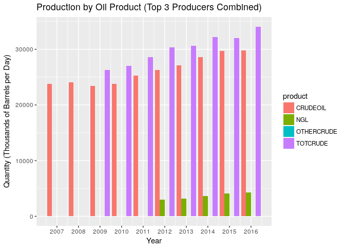
Ideally we would use Total to compare production but there are a lot of missing datapoints (NA values) on anything that isn’t crude oil. For this reason the graphs in the rest of this document are using the Crude Oil product. As the graph below shows this is a reasonable assumption since most of the production is crude oil, and it roughly follows the same pattern.
World Production
In this section we are going to first look at the world prodution and then drill down to the country level. The goal is to give an idea on who the top producers are and look at the recent changes and trends.
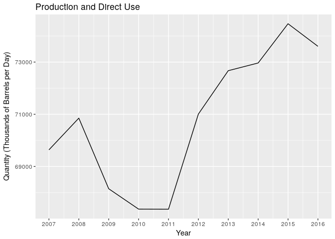
The world production has gone up in the past 10 years, with the exception of the Great Recession of 2008, which lowered demand and production. It was mostly flat between 2009 and 2011 and it picked up nicely afterwards.
Top Producers
Three countries are definitely the top producers: Saudi Arabia, Russia, and the United States. To compete in the top three, a country has to be able to produce around 10 million barrels per day.
Iraq, China, and Iran complete the top 5 across the last four years. Their output ranges between 3 and 5 million barrels per day.
| Country | 2016 | 2015 | 2014 | 2013 |
|---|---|---|---|---|
| SARABIA | 10489 | 10193 | 9713 | 9637 |
| RUSSIA | 10378 | 10111 | 10088 | 10047 |
| USA | 8901 | 9415 | 8764 | 7468 |
| IRAQ | 4661 | 3504 | 3110 | 2978 |
| CHINA | 4003 | 4289 | 4200 | 4175 |
| IRAN | 3661 | 3152 | 3117 | 3576 |
| CANADA | 3110 | 2849 | 2779 | 2504 |
| KUWAIT | 2712 | 2640 | 2869 | 2922 |
| BRAZIL | 2522 | 2443 | 2260 | 2029 |
| UAE | 2466 | 3224 | 3037 | 3048 |
| VENEZOPEC | 2386 | 2656 | 2683 | 2787 |
| MEXICO | 2162 | 2270 | 2434 | 2531 |
| NIGERIA | 1827 | 2135 | 2189 | 2219 |
| ANGOLALL | 1713 | 1762 | 1651 | 1702 |
| NORWAY | 1643 | 1593 | 1563 | 1526 |
Trends
Recent trends that can be seen in the production table:
- The United States has consistently increased production and is getting close to the top 2 (Saudi Arabia and Russia)
- Iraq has increased production by about 50%, becoming a solid number four
- Venezuela's output has decreased by about 10%
- Nigeria's output has decreased by almost 20%
If we only look at the three major producers, we can see that the United States has recovered a lot of ground in the last few years:

Individual Countries
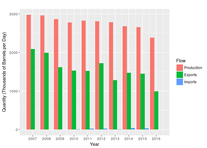
Saudi Arabia
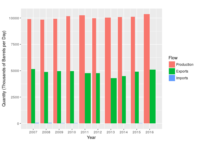
Saudi Arabia is usually considered the world top producer, even though Russia comes pretty close and actually produced more than Saudi Arabia in some years. Because of its low consumption, mostly due to having a small population (31.54 million as of 2015), Saudi Arabia exports most (80%) of what it produces.

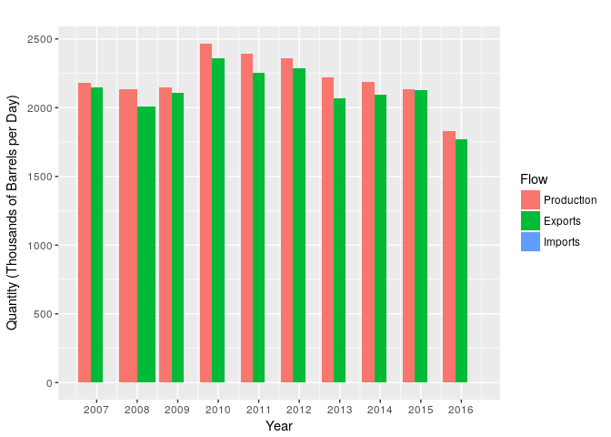
Russia
Russia produces as much as Saudi Arabia, and even more in some years. Russia has a larger population (144.1 million as of 2015) and a bigger consumption than Saudi Arabia. Russia is able to export about half of what it produces.
United States
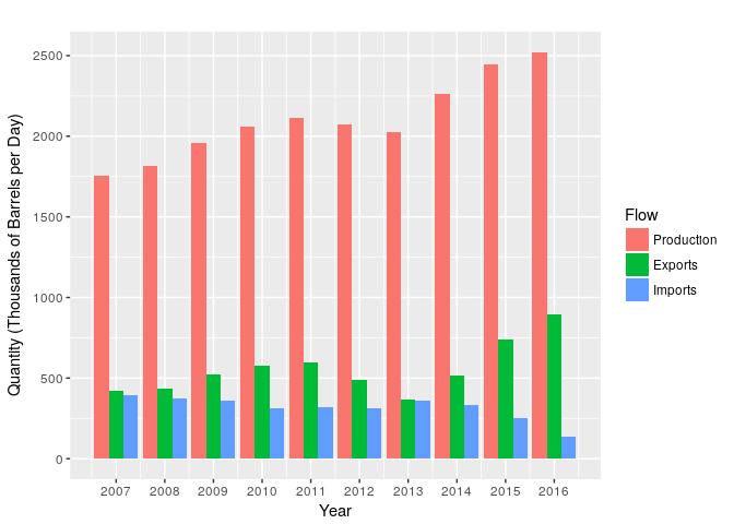
The production of the United States is close to the top 2, but it still has to import a significant amount of oil. Its large population (321.4 million as of 2015) and high consumption per capita makes the U.S. import the equivalent of one more top producer.
The graph shows a boom in oil production after 2010, which is commonly attributed to the technological advances in horizontal drilling and hydraulic fracturing. The graph also shows declining imports and rising exports, although exports are still tiny when compared to production and imports.

Iraq
Iraq is an OPEC member and has become the second OPEC producer after Saudi Arabia and the fourth in the world. Iraq doubled its oil production in the past ten years.

Venezuela
Venezuela is another OPEC member. Its economy is highly dependent on oil and is the classic example of a petro state. Its oil output has been decreasing by about 20% in the past few years.
Nigeria
Nigeria is another petro-state. It exports most of what it produces. Its output has also been decreasing in the past five years, but the ten year graph shows a bit more ups and downs.
Brazil
Brazil has mostly increased production in the past 10 years. It exports about a third of what it produces.