COVID-19: United States and Italy
Introduction
This blog post is about evaluating the growth rate of the spread of COVID-19 in the United States and Italy.
The virus has already inflicted a lot of suffering to many people around the world, the hope is that analyses of past and present behavior will help us be better prepared in the future.
Dataset
- For the United States, the data used is from the COVID Tracking Project, which aggregates data from state and local governments
- For Italy, the data is provided by the Civil Protection Department on a Github repository
Both datasets provide time series data about the number of cases, deaths, people being tested, and more.
What we are going to use in this analysis is the number of people who tested positive, and the number of deaths. The former gives an idea of what to expect in the future, but seems highly dependent on how much testing is performed. The latter is more realistic (assuming that most covid deaths are reported) but lags in showing the effects of measures such as lockdowns and social distancing.
Methodology
Most of the growth curves are simple exponential curves. Here we estimate the parameters of an exponential function, and show the growth rate. A growth rate of 1.30 means 30% day to day growth.
Most graphs shown in the rest of this post show the side by side comparison of positive over time, and deaths over time.
United States and Italy

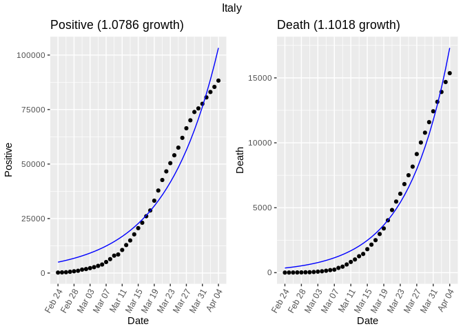
The United States is currently experiencing 17.3% daily growth in the number of positive cases, and about 24% growth in the number of deaths. The inferred exponential function is a good fit, especially for the graph about deaths.
If we look at the graph below for Italy, the exponential function is no longer a good fit for either positive or deaths, because it appears to have flattened. A sigmoid function would fit better, but that will be left for a later improvement to the methodology.
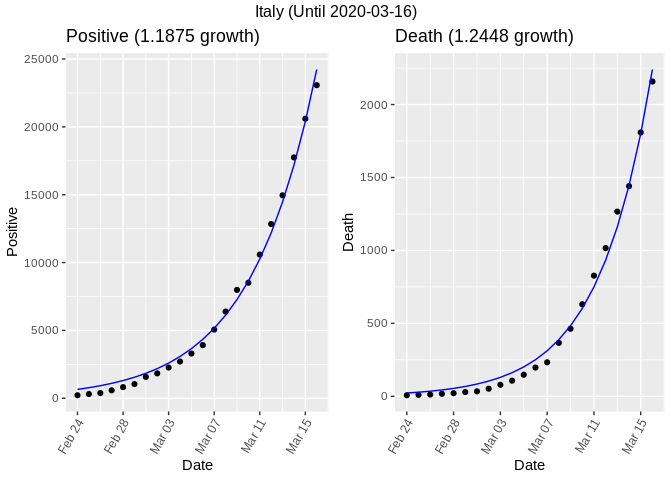
To really compare the United States with Italy, we need to look at the period for Italy that has experienced exponential growth. In the next graph we only kept the dates on or before March 17th.
Until then, the daily growth in the number of cases was almost 19% and for deaths it was 24%. These numbers are remarkably similar to what the United States is experiencing at this time.
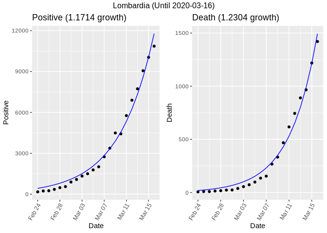
If we drill down to one of the most hit regions of Italy (Lombardia, the region where Milan is), we surprisingly find slightly lower numbers.
US State-by-State Analysis
The following table shows the growth rates for the US broken up by state. Death Growth and Positive Growth are the same rates as computed in the prior section. We are also showing the total numbers of deaths, positive, and tested to help contextualize the growth (e.g., 40% growth when the number of cases is very low could be just caused by reporting and is unlikely to be sustained in the future).
[1] “Error while computing growth rate for state MP Error in nls(series ~ exp(a + b * rownumber), data = data, start = start): number of iterations exceeded maximum of 50\n” [1] “Error while computing growth rate for state MP Error in nls(series ~ exp(a + b * rownumber), data = data, start = start): singular gradient\n”
Below are the side by side graphs for some selected
states.
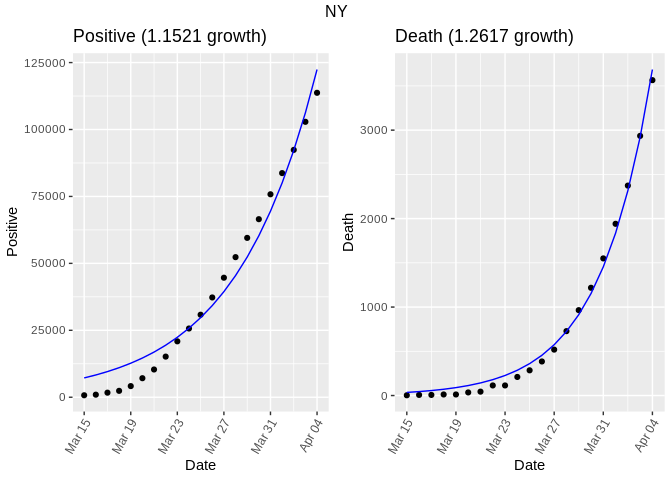
New York seems to have flattened the positive growth curve, but its death growth is still exponential. It is the state that seems to be closer to Italy in terms of timeline.
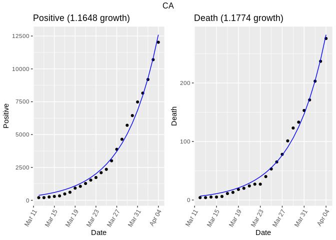
California is still in the exponential growth phase, but its death growth is a bit better than the national one.
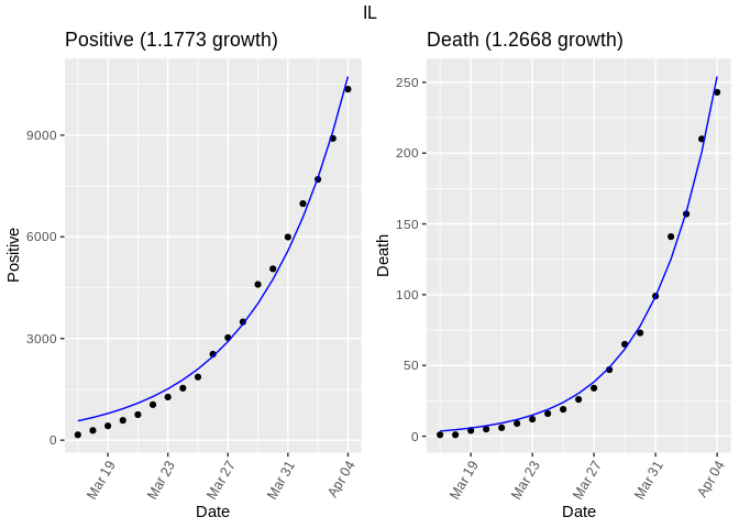
Illinois is also in the exponential growth phase. The growth is slowing down on a daily basis, but the exponential function is still a very good fit.
Conclusion
There is still a lot to do to make this analysis more informative, but it was interesting to see how close to a simple exponential most of these curves are. Hopefully the curves will flatten everywhere.
Next I’ll be working on figuring out how these growth rates change over time. Please leave some comments below with suggestions or things I might have missed.